
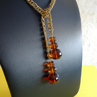
 One of the street teams I belong to in etsy.com is ETSY Beadweavers. A group of very talented artisans equally obsessed as I am about weaving teeny tiny seed beads into gorgeous wearable art. We have a monthly theme going on now. The above creation was done by NoEasyBeads, titled "Midnight On The Bayou Raku Necklace"as her entry for this month's challenge on "Hot August Nights." Check out the other hot artisan jewelry and vote on your favorite!
Thursday, August 30, 2007
Hot August Nights Etsy Beadweavers Challenge
One of the street teams I belong to in etsy.com is ETSY Beadweavers. A group of very talented artisans equally obsessed as I am about weaving teeny tiny seed beads into gorgeous wearable art. We have a monthly theme going on now. The above creation was done by NoEasyBeads, titled "Midnight On The Bayou Raku Necklace"as her entry for this month's challenge on "Hot August Nights." Check out the other hot artisan jewelry and vote on your favorite!
Saturday, August 25, 2007
Crafty Helper? Crafty Businessman in the Making!
 I'm fortunate that I'm never alone when I go to craft shows. I always have my son with me. Why? That's because he has his own craft to sell - origami. My son has been doing origami since he was 5 years old. He has always been fascinated with paper - cutting it, crumpling it and finally discovering the joys of folding. Now at the veteran age of 11, he can do large origami figures from one long sheet of paper or the smallest crane I have seen from a 1cm square piece of paper (click here for my previous post on this). So when I started doing craft shows, he sets his origami table next to mine. It's great moral support to have him by me!
Sunday, August 19, 2007
Chiaroscuro – a play on light and shadow
 (Another edition for Etsy Bloggers' Blog Carnival!)
When I first took Humanities in college I first learned the word “Chiaroscuro.” A technique made popular during the Baroque period by Caravaggio, I think. Simply put, it is a bold contrast in light and dark. In shooting my jewelry, I instinctively go for this look. Now you can’t altogether be too dark since buyers need to see details, but play on light gives your presentation a little drama – which hopefully hooks your buyer.
I like to see where the light is coming from and usually it comes from one direction in my photos. Take the first photo above (Carnelian Quartz Gold Lauriat). I shot this in the morning, right by a window sill, with the blinds partially down but with some slots open to let the light hit the carnelian quartz and catch the gleam of the crystals so that it reflected on the dark leather. The right to left contrast of light to dark also gives the piece depth so you can just see how round those stones are.
 Understand, I am not a professional photographer and I have never taken a photography lesson. My best photos have been taken by a simple Fuji FinePix A345. I also have a “newer” Olympus FE-170 but for some reason the
Another way to play with light and dark is use of background like in the beadwoven bracelet (Beaded Scallop Bracelet). The light once again is morning light, sourced from the right. The yellow background offsets the dark beads of the bracelet at the same time catches the natural light and reflects if back into the black leather surface. Again, this creates depth. But more importantly, when you are looking at thumbnails on the etsy site, light & dark contrast like this helps to make your picture stand out which is exactly what you want.
The third photo (Beads on Copperwire Bangle) is a similar example of this play on light and shadow. This time the contrast in background colors of blue and black, contrasts with the piece itself with the light holding all the elements together.
Finally, the best tip I think anyone can ever show you – CLOSE-UPS! Beware of close-ups though. You need to make sure your jewelry is perfect because taking extreme close-ups is literally putting your jewelry under a microscope!
I bid you adieu with these close-up shots.


Saturday, August 18, 2007
I'm in Print!


 Months ago, I participated in a collaborative project as a call for artists by Belle Armoire magazine. Together with a group of etsy artists, we created a charm necklace with each charm representing each artist's concept of the Etsy Community. Lo and behold, our submission was accepted by Belle Armoire and is now featured in their Sept/Oct 2007 issue! I've included a picture of the necklace and a detail of the freeform beaded pendant I submitted for the project. I also include the published article that goes with the necklace. Read on!
Wednesday, August 15, 2007
Le Chic! Le Wicked!
 I just found out that my Embellished Gold Bracelet is featured in WickedlyChic.com!!! They have a Daily Ditties sections (see under August 13) featuring some neat handmade stuff. This happens to be the same bracelet I did an article on and will be featured in the holiday issue of Step By Step Beads magazine! Wicked!
Sunday, August 12, 2007
Etsy Bloggers Street Team Presents a Carnival of Colors!
 It is my honor to host this week’s edition of the Etsy Bloggers Street Team Blog Carnival – Carnival of Colors! Take a peek at my post about this just yesterday. Now treat your eyes and surf the Etsy blogoshere for a rainbow of colors and interesting stories from talented indie artists!
Yazmin shows how she tackles a challenging project in a Ring of Colors posted at A Pretty Rock Jewelry - blog.
Ginger Black opens a little window into her world in her own Carnival of Colors! Read on for An Adventure in Glass.
MrsDragon features a parade of talented Etsy artists in All the Colors of Etsy posted at Mrs. Dragon's Wares.
Purple is my favorite color and I found out Alicia Mae loves it, too, with her article Purple!! here in AliciaMae's Xanga.
Judy raves about Fuchsia In All Its Glory as featured in Artsy Clay.
Sue confesses she is “quite addicted to Altered and Mixed Media art” in A Carnival of Colors with ZNE Etsy. Read about it at The Lily Pepper Blog.
Enjoy an eye-popping experience with Christine as she shows how My life is a carnival of colors featured in Eye Pop Art.
Lis reveals to us the inner workings of a favorite Etsy "toy" in Secrets of the Etsy Color Picker as seen in Etsy Shops.
We have a radical (aren’t we all?) in Karen who dares to showcase the glamour of the UN-colored in her post at faded willow.
Shannon talks about her favorite season in her article Carnival of Colors: Getting Ready for Autumn featured in Anodyne Design.
Jen of Baby Friendly Beads tells us why blue is her favorite color in Tangled Up in Blue posted at Mama's Magic.
Confections presents Colorful Custom-Carded Rolags and Needlefelted Flower. Find out more in her blog Stelladanza.
And by photo finish, TantalizingStitches presents Tantalize Your Baby with Crochet! posted in Tantalizing Creativity.
My thanks to Linda James of Flame On Glass for her photo of Orphanz beads which goes so perfectly with our Carnival of Colors theme. Linda makes the most beautiful lampwork beads I've ever seen.
Next week’s carnival titled “Picture Perfect” will be hosted by Heather in her blog, Humble Beads Blog, with tips for taking pictures - interesting! That’s it for this carnival parade of colors!
Carnival of Colors!
 This week's Etsy Bloggers Street theme is "Carnival of Colors." It is also my first time to host so it should be exciting! (I'll be posting the carnival by tonight so don't fret). I beat my brains out for what to feature (I suggested the concept I should be able to think of one - duh!) till it dawned on me as I was setting up for a show yesterday morning. I had dumped my bracelets on the table - voila! my carnival of colors photo. Enjoy!
Subscribe to:
Comments (Atom)


